Hacker

Title analysis

Title analysis timeline for three films:
Textual analysis for three films: font, size, colour, bold/italic/underline

1) Iron Man
2) Ocean's Eleven
3) Catch Me If You Can

Iron Man:
T1: 0.10 seconds, capitals, font about 40, colour: red, centred.


T2: 0.13 seconds, capitals, font about 30, colour: red, placed to the left.


T3: 0.15 seconds, capitals, font about 30, colour: red, centred.
T4: 0.19 seconds, capitals, font about 30, colour: red, centred.

T5: 0.21 seconds, capitals, font about 30, colour: red, centred upper.
T6: 0.24 seconds, capitals, font about 30, colour: red, centred upper.
T7: 0.26 seconds, capitals, font about 30, colour: red, centred upper.
T8: 0.28 seconds, capitals, font about 30, colour: red, placed to the left in the centre.

T9: 0.32 seconds, capitals, font about 35, colour: red, centred.
T10: 0.35 seconds, capitals, font about 30, colour: red, placed to the left in the centre.
T11: 0.37 seconds, capitals, font about 30, colour: red, centred.
T12: 0.42 seconds, capitals, font about 30, colour: red, placed in the upper centre.


T13: 0.43 seconds, capitals, font about 30, colour: red, placed in the upper centre.


T14: 0.47 seconds, capitals, font about 40, colour: red, placed dead in the centre.

T15: 0.51 seconds, capitals, font about 35, colour: red, placed in the right upper centre.
T16: 0.53 seconds, capitals, font about 35, colour: red, placed in the upper centre.


T17: 0.56 seconds, capitals, font about 35, colour: red, placed in the left centre.


T18: 0.58 seconds, capitals, font about 40, colour: red, placed in the far left centre. 


T19: 1.00 minute, capitals, font about 40, colour: red, placed in the bottom right. 


T20: 1.03 minute, capitals, font about 30, colour: red, placed in the bottom right. 


T21: 1.09 minute, capitals, font about 40, colour: red, placed in the centre slightly to the right. 


T22: 1.21 minute, capitals, font about 40, colour: red, placed dead in the centre.


For the more important titles, they are placed in the centre of the screen, for example "Robert Downey Jr" (as he is the main actor) and "a JON FAVREAU film" (as this is the company that produced the film.) All of the text is written in red, so to stand out from the black background. The less important titles are in font sizes 30-35 and the more important titles are in about size 40, to make them bigger and stand out more. Less important actors/actresses share the screen, for example "Robert Downey Jr" has his own as he is more famous and "Faran Tahir and Clark Gregg" have a shared screen. Words to introduce the titles like 'a' 'and' and 'by' are not in capitals, where as titles that say what the person did e.g. 'music supervisor' and 'costume designer' are in capitals. There is longer screening time for the more important titles, for example "a JON FAVREAU film" is displayed for about 6 seconds where as there is a one second gap from 'music supervisor' and 'casting by.' 

Ocean's Eleven: 
T1: 0.02 seconds, capitals, font about 40, colour: black, placed in the centre (some in bold.) 


T2: 0.05 seconds, capitals, font about 40, colour: black, placed in the centre (some in bold.) 


T3: 0.08 seconds, capitals, font about 40, colour: black, placed in the bottom left (some in bold.)


T4: 0.10 seconds, capitals, font about 40, colour: white, placed in the top left (some in bold.)


T5: 0.13 seconds, capitals, font about 40, colour: white, placed in the top left (some in bold.)


T6: 0.20 seconds, capitals, font about 40, colour: white, placed in the top left (some in bold.)


T7: 0.25 seconds, capitals, font about 40, colour: white, placed in the top left (some in bold.)


T8: 0.31 seconds, capitals, font about 40, colour: white, placed in the middle right (some in bold.)


T9: 0.32 seconds, capitals, font about 40, colour: white, placed in the middle right (some in bold.)


T10: 0.36 seconds, capitals, font about 40, colour: white, placed in the middle right (some in bold.)


T11: 0.41 seconds, capitals, font about 40, colour: white, placed in the upper middle (some in bold.)


T12: 0.42 seconds, capitals, font about 40, colour: white, placed in the upper middle (some in bold.)


T13: 0.44 seconds, capitals, font about 40, colour: white, placed in the upper middle (some in bold.)


T14: 0.51 seconds, capitals, font about 40, colour: white, placed in the upper right (some in bold.)


T15: 0.54 seconds, capitals, font about 40, colour: white, placed in the upper right.


T16: 1.00 minute, capitals, font about 40, colour: white, placed in the centre left, bold font.


T17: 1.05 minute, capitals, font about 40, colour: white, placed in the centre (some in bold.)


T18: 1.10 minute, capitals, font about 40, colour: white, placed in the centre (some in bold.)


T19: 1.14 minute, capitals, font about 40, colour: white, placed in the centre (some in bold.)


T20: 1.21 minute, capitals, font about 40, colour: white, placed in the centre right (some in bold.)


T21: 1.25 minute, capitals, font about 40, colour: white, placed in the centre right (some in bold.)


T22: 1.31 minute, capitals, font about 40, colour: white, placed in the centre, bold font. 


The actors appear in the order of who is most famous, the more famous they are the longer screening time they have. All of the actors/actresses surnames are in bold. Again, words like 'and' 'by' and 'a' are in smaller font. All of the main font appears to be the same size, and as it is mostly in white it stands out against the coloured backgrounds. The most important titles are placed in the centre of the screen, for example "directed by, STEVEN SODERBERGH." 

Catch Me If You Can:
T1: 0.03 seconds, bold, font about 30, colour: black, placed in the centre right. 
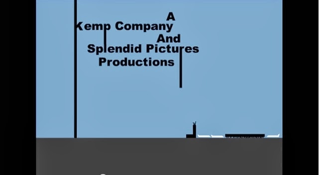


T2: 0.15 seconds, bold, font about 30, colour: black, placed in the upper left. 


T3: 0.21 seconds, bold, font about 30, colour: black, placed in the centre.


T4: 0.28 seconds, bold, font about 30, colour: black, placed in the upper right. 


T5: 0.30 seconds, bold, font about 30, colour: black and white, placed in the upper centre. 


T6: 0.35 seconds, bold, font about 30, colour: black, placed in the centre. 


T7: 0.41 seconds, bold, font about 30, colour: black, placed in the centre right. 


All of the font is in the same size and all in the same colour, black (expect from the 'me' in 'catch me if you can' which is white, to stand out, as the whole film is based around one main character.) All of the font is in bold to stand out against the background. The screen time the titles get is pretty even, although the actors/actresses are again listed around who is most important/famous. The title sequence finishes off with who produced and directed it, which they obviously thought was the most important person behind the film. In the previous two films, less important words like 'and' 'a' and 'by' were in smaller font, but in this title sequence they are in the exact same size font as all of the other words, this makes it look quite neat, tidy and professional.

I have learnt the significance of why title sequences put the company who produced the film first, as they own it and want people to know that. I have also learnt how important it is to carefully plan how long it will be between each title, and to put them in order of importance, but also finish with a significant name or role to leave the audience with that in their heads. 


Prelim Task

Title: People just ain't no good
Genre: action
Planning: (me, Drea, Ben and Sam)

The PowerPoint includes the storyboard, the production diary, a shooting schedule and a props/music list:


The final thing:


Prelim Task Evaluation:
I worked with Ben, Drea and Sam and we managed the task between us in the following way: I produced the script, Drea drew the pictures on the storyboard and made the production diary, Ben was in charge of thinking of all the props we needed and Sam found all the music for our film. We all worked on the storyboard together and came up with all the frames, angles and movement. We planned our sequence by thinking of the stereotypical things you would find in an action, for example a good guy bad guy combo, capes and violence. We then developed on these ideas and came up with the idea of a troubled girl at school who seeks the help of a hero. We took into account Dyer's theory, as he believes stereotypes come down to power, those who have power stereotype those who don't, so in this instance Drea was stereotyped as the innocent, vulnerable girl who needed help. For our task we used cameras and tripods to film and for the editing, we used adobe premiere and audacity to record some voiceovers. When planning, shooting and editing we had to take into account the limited space we had, as we could only use the school. We then planned to film in three spaces: down the lockers, on the playground and on the field. We edited all together in the classroom and made sure everyone in the group was happy before we exported it. I think our sequence was very successful as we all worked together and pulled our weight. The filming and editing went really well. In hindsight, if we did it again, I would perhaps use something like a trailer to hold the camera more steady to perfect shots like tracking. Also, there is one shot where Sam holds his hand out to help Drea up, and when the camera changes angle, he holds his hand out again, little tweeks like this need to be perfected if we were to do it again. What did others say about your production? From completing the task, I have learnt that team work is key and providing everyone a certain task within the sequence helps to get everything done successfully. I think this task will be significant when completing the rest of my foundation coursework as I have learnt how to put a lot of different shots into a long film by editing, add transitions, music and also work well with other people. As well as this, I have learnt how to plan successfully and make sure every element of the sequence is considered within the planning which will definitely come in handy when producing my foundation coursework.

Textual Analysis for 3 genres

Textual analysis: Mise en scène, sound, editing and camera. 

Boyz 'N the Hood: analysis of the first five minutes
Genre: crime fiction, teen film, coming of age, drama

Mise en Scène: 
Setting and props: South Central, Los Angeles 1984
Costume, hair and make up: jumpers and smart shirts for boys, skirts and cardigans for girls, all quite stereotypical clothing for black school children who do not have to wear compulsory uniform. Short hair for boys and hair tied up for girls, nothing unusual or special. No particular make-up.
Facial expressions and body language: shocked when they see the blood, laughing in class at Trey's jokes and when the boys fights.
Positioning of characters/objects within the frame: characters are always placed quite central within the frame, they are all important. When Trey is walking along the path, the guys beating another guy are up positioned to the left of the frame, we are suppose to be watching them.
Lighting and colour: daylight, so high key lighting and nice blue colours, nothing unusual is happening at the moment.
Sound and editing:
Off screen diegetic sound at the beginning of taboo language. Textual editing, the facts are going to teach us something. Flash on gunshot and zoom into stop sign is symbolic, stop the crime? Gun shots and zoom/flash onto the Presidents face, this is important to show the problems Los Angeles had at the time. Low base boom sounds, tragic event has happened (someone died.) Off scene then on scene diegetic sound of teacher talking. Whispy music when they begin to fight, tension is building. Off scene diegetic sound, conversation between teacher and mum, the teacher is being patronising and borderline racist.
Memorable camera shots:
Tracking level shot when the kids are walking to school because we can see the type of place they live in as well, e.g. broken windows, stray dogs eating out of bins.
Long wide shot of Trey walking along but we can only focus on guys beating up another guy in the left of the shot, catches our attention to again show the type of place they live in.
Medium four shot of them all behind the 'do not cross' line, curious kids who find the death of someone totally normal and not shocking at all, again relates back to the type of place they live in.

The Little Mermaid 2: analysis of the first five minutes
Genre: animated musical, children's fantasy

Mise en Scène:
Setting and props: set mainly on the boat and in the sea, also underneath the sea at times.
Costume, hair and make up: classy dresses for the women and sailor outfits for the men, or mermaid/mermen outfits for the people in the sea. Hair slicked back neatly for men and neatly tied up for women, this all shows it is a special occasion. Animated make-up.
Facial expressions and body language: happy and excited at the beginning for the child's introduction to King Triton and then shocked and sad when Ursula's evil sister tries to kidnap Melody, the body language all images this.
Positioning of characters/objects within the frame: the boat is the main focus of most of the extreme wide shots or features of the boat for example the anchor and chains. The characters are all positioned in the middle of the frame except from Ursula's evil sister, she is less important.
Lighting and colour: sunny blue skies when the child is being introduced to King Triton and then grey, black skies when the kidnapping is taking place, foreshadowing something bad.
Sound and editing: 
Sweet soft lullaby music at the beginning when Ariel is singing to her child, she is clearly excited for what is about to happen. Cheery, bubbly singing from her husband Prince Eric who is trying to be patient with her but is telling her to hurry along. King Triton has a very soft dialogue, this represents he is friendly and approachable as King. Ursula's sister has a croaky mean dialogue, this represents she is evil and bad. As it is an animation all of the sound we hear in non-diegetic as everything has to be put in afterwards. Sound effects have been used such as the seagull skwaking or the 'dun dun' of the shark where he is trying to be intimidating.
Memorable camera shots:
Level long shot of Ariel cradling and singing to Melody at the beginning, her child means a lot to her and she wants to protect her from all evil.
Close up of King Triton when he rises out of the water, he is powerful with the Triton in his hand yet he is rising up to his daughter, he respects her a lot and will do anything to protect her.
Level long shot of Ursula's sister when she is bouncing Melody up and down on one of her tentacles, this shows that she is careless but powerful and will do anything to get what she wants, she is fearless.

Les Mis: analysis of the first five minutes
Genre: historical fiction, epic 

Mise en Scène:
Setting and props: France 1815.
Costume, hair and make up: the more powerful people are wearing police outfits e.g neat blue pinafores and hats, their job makes them wealthy. The prisoners are all wearing dirty, tattered brown uniforms, they are treated badly. Most of the prisoners heads are shaven but most have long scraggly beards that are clearly not kept in a tidy condition. The police are wearing hats with neat hair. The prisoners have make up to make them look tired and angered and the police are made to look stern and powerful.
Facial expressions and body language: the prisoners look tired and angered they are kept in such terrible conditions and that they are there in the first place. There body language shows they are trying to be strong by pulling the boat in but deep down feel drained. The police look smug and are placed higher then the prisoners, so they are looking down on them- they have the power.
Positioning of characters/objects within the frame: the main police guy is placed in the middle of the part of the boat he is standing on, he is important and powerful. There are many close ups of the prisoners faces, they are all placed to the side of the frame, they are unimportant.
Lighting and colour: it is dark and misty, this reflects the moods of the prisoners. There is only sunlight when it is behind Javert, he is the 'chosen' guard for them and has the power to be nice or nasty.
Sound and editing: 
There is silence at the start, we should be reading the facts. A big boom of music, the ship is extremely important, this is the thing that separates the prisoners from being weak or strong. The prisoners are all singing but with harsh sounds, they are singing it through gritted teeth, there are annoyed and bitter. Javert has a very patronising dialogue, he is in charge and he knows it. There is an uplifting sound of music when Val Jean retrieves the flag, nobody expected him to be strong and do it, this shows he is a strong character and may come out on top?
Memorable camera shots:
Extreme wide shot of the police man standing on top of the boat in the middle. He is higher up then them all looking down, he is powerful and thinks that all the prisoners deserve to be there.
Close up of one of the prisoners. He looks angry and resentful of the man above him, he holds a grudge and wishes to perhaps get his revenge.
Extreme wide shot of all of the prisoners working together. They are in a team against the police even though they do not know anything about each other, the one thing they have in common is hatred.

Sound

Sound

On screen sound: the sound we can hear is coming from something on screen e.g. we see someone talking on the telephone.
Off screen sound: we can't see where the sound is coming from e.g. outside the room.
Diegetic: sound we hear as actors
Non-diegetic: something put in afterwards e.g. soundtrack and voiceovers.
Dialogue: how its spoken, not just what is said.
Foley sound effetcs: sound effects put in for silent movies e.g. rice in a jar for rain.
Voiceover: getting inside characters' heads, thoughts/feeling, or a narrator explains what is going on.
Parallel: music and sound matches the action e.g. slow motion running across a field to meet a loved one = soft romantic music.
Contrapuntal: music and sound doesn't match the action e.g in Clockwork Orange when people are being tortured in their homes,Singing in the Rain (a cheery song) is playing.