Title analysis timeline for three films:
Textual analysis for three films: font, size, colour, bold/italic/underline
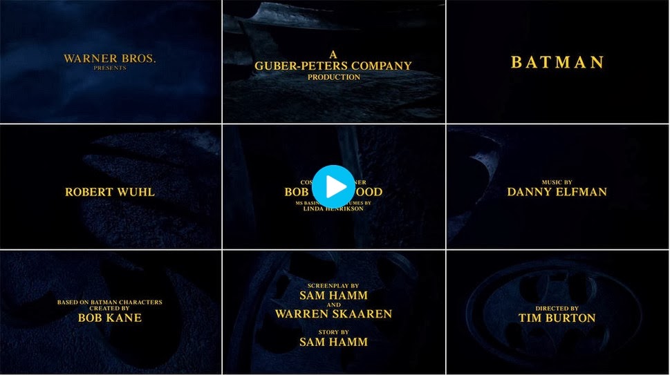
1) Iron Man
2) Ocean's Eleven
3) Catch Me If You Can
Iron Man:

T1: 0.10 seconds, capitals, font about 40, colour: red, centred.

T2: 0.13 seconds, capitals, font about 30, colour: red, placed to the left.

T3: 0.15 seconds, capitals, font about 30, colour: red, centred.

T4: 0.19 seconds, capitals, font about 30, colour: red, centred.

T5: 0.21 seconds, capitals, font about 30, colour: red, centred upper.

T6: 0.24 seconds, capitals, font about 30, colour: red, centred upper.

T7: 0.26 seconds, capitals, font about 30, colour: red, centred upper.

T8: 0.28 seconds, capitals, font about 30, colour: red, placed to the left in the centre.

T9: 0.32 seconds, capitals, font about 35, colour: red, centred.

T10: 0.35 seconds, capitals, font about 30, colour: red, placed to the left in the centre.

T11: 0.37 seconds, capitals, font about 30, colour: red, centred.

T12: 0.42 seconds, capitals, font about 30, colour: red, placed in the upper centre.
T13: 0.43 seconds, capitals, font about 30, colour: red, placed in the upper centre.
T14: 0.47 seconds, capitals, font about 40, colour: red, placed dead in the centre.

T15: 0.51 seconds, capitals, font about 35, colour: red, placed in the right upper centre.
T16: 0.53 seconds, capitals, font about 35, colour: red, placed in the upper centre.

T17: 0.56 seconds, capitals, font about 35, colour: red, placed in the left centre.
T18: 0.58 seconds, capitals, font about 40, colour: red, placed in the far left centre.
T19: 1.00 minute, capitals, font about 40, colour: red, placed in the bottom right.

T20: 1.03 minute, capitals, font about 30, colour: red, placed in the bottom right.
T21: 1.09 minute, capitals, font about 40, colour: red, placed in the centre slightly to the right.
T22: 1.21 minute, capitals, font about 40, colour: red, placed dead in the centre.
For the more important titles, they are placed in the centre of the screen, for example "Robert Downey Jr" (as he is the main actor) and "a JON FAVREAU film" (as this is the company that produced the film.) All of the text is written in red, so to stand out from the black background. The less important titles are in font sizes 30-35 and the more important titles are in about size 40, to make them bigger and stand out more. Less important actors/actresses share the screen, for example "Robert Downey Jr" has his own as he is more famous and "Faran Tahir and Clark Gregg" have a shared screen. Words to introduce the titles like 'a' 'and' and 'by' are not in capitals, where as titles that say what the person did e.g. 'music supervisor' and 'costume designer' are in capitals. There is longer screening time for the more important titles, for example "a JON FAVREAU film" is displayed for about 6 seconds where as there is a one second gap from 'music supervisor' and 'casting by.'
Ocean's Eleven:
T1: 0.02 seconds, capitals, font about 40, colour: black, placed in the centre (some in bold.)
T2: 0.05 seconds, capitals, font about 40, colour: black, placed in the centre (some in bold.)
T3: 0.08 seconds, capitals, font about 40, colour: black, placed in the bottom left (some in bold.)
T4: 0.10 seconds, capitals, font about 40, colour: white, placed in the top left (some in bold.)
T5: 0.13 seconds, capitals, font about 40, colour: white, placed in the top left (some in bold.)
T6: 0.20 seconds, capitals, font about 40, colour: white, placed in the top left (some in bold.)
T7: 0.25 seconds, capitals, font about 40, colour: white, placed in the top left (some in bold.)
T8: 0.31 seconds, capitals, font about 40, colour: white, placed in the middle right (some in bold.)
T9: 0.32 seconds, capitals, font about 40, colour: white, placed in the middle right (some in bold.)
T10: 0.36 seconds, capitals, font about 40, colour: white, placed in the middle right (some in bold.)

T11: 0.41 seconds, capitals, font about 40, colour: white, placed in the upper middle (some in bold.)

T12: 0.42 seconds, capitals, font about 40, colour: white, placed in the upper middle (some in bold.)
T13: 0.44 seconds, capitals, font about 40, colour: white, placed in the upper middle (some in bold.)
T14: 0.51 seconds, capitals, font about 40, colour: white, placed in the upper right (some in bold.)
T15: 0.54 seconds, capitals, font about 40, colour: white, placed in the upper right.

T16: 1.00 minute, capitals, font about 40, colour: white, placed in the centre left, bold font.

T17: 1.05 minute, capitals, font about 40, colour: white, placed in the centre (some in bold.)
 T18: 1.10 minute, capitals, font about 40, colour: white, placed in the centre (some in bold.)
T19: 1.14 minute, capitals, font about 40, colour: white, placed in the centre (some in bold.)
T20: 1.21 minute, capitals, font about 40, colour: white, placed in the centre right (some in bold.)
T21: 1.25 minute, capitals, font about 40, colour: white, placed in the centre right (some in bold.)
T22: 1.31 minute, capitals, font about 40, colour: white, placed in the centre, bold font.
The actors appear in the order of who is most famous, the more famous they are the longer screening time they have. All of the actors/actresses surnames are in bold. Again, words like 'and' 'by' and 'a' are in smaller font. All of the main font appears to be the same size, and as it is mostly in white it stands out against the coloured backgrounds. The most important titles are placed in the centre of the screen, for example "directed by, STEVEN SODERBERGH."
Catch Me If You Can:
T1: 0.03 seconds, bold, font about 30, colour: black, placed in the centre right.
T2: 0.15 seconds, bold, font about 30, colour: black, placed in the upper left.
T3: 0.21 seconds, bold, font about 30, colour: black, placed in the centre.

T4: 0.28 seconds, bold, font about 30, colour: black, placed in the upper right.
T5: 0.30 seconds, bold, font about 30, colour: black and white, placed in the upper centre.

T6: 0.35 seconds, bold, font about 30, colour: black, placed in the centre.
T7: 0.41 seconds, bold, font about 30, colour: black, placed in the centre right.
All of the font is in the same size and all in the same colour, black (expect from the 'me' in 'catch me if you can' which is white, to stand out, as the whole film is based around one main character.) All of the font is in bold to stand out against the background. The screen time the titles get is pretty even, although the actors/actresses are again listed around who is most important/famous. The title sequence finishes off with who produced and directed it, which they obviously thought was the most important person behind the film. In the previous two films, less important words like 'and' 'a' and 'by' were in smaller font, but in this title sequence they are in the exact same size font as all of the other words, this makes it look quite neat, tidy and professional.
I have learnt the significance of why title sequences put the company who produced the film first, as they own it and want people to know that. I have also learnt how important it is to carefully plan how long it will be between each title, and to put them in order of importance, but also finish with a significant name or role to leave the audience with that in their heads.

 T1: 0.04 seconds, capitals, font about 50, colour: red, bottom centred.
 T2: 0.09 seconds, capitals, font about 40, colour: red and white, middle left and right.
 T4: 0.34 seconds, capitals, font about 30, colour: white, upper left.
 T5: 0.41 seconds, capitals, font about 30, colour: red and white, middle left and right.
 T6: 0.50 seconds, capitals, font about 40, colour: white, middle/upper left.
 T7: 1.06 seconds, capitals, font about 40, colour: white, middle/upper left.
 T1: 0.05 seconds, capitals for first initial, font about 20, colour: white, bottom right.
  T2: 0.10 seconds, capitals for first initial, font about 20, colour: white, bottom right.